Designing for Print

Download a reference guide for
more information about designing
for print

We have compiled some tips for getting your job printed more quickly and successfully.

  • Build to the final size. For example, a poster you design 8.5x11 to be printed 11x17 will not work. 8.5x11 does not proportionately scale up to be 11x17. Also, images may lose quality when increased in size.
  • Add .125" of bleed if you have any artwork or images that go to the edge of the page. This is for trimming. Please see our page with instructions on adding bleed.
  • Proof the whole document, but especially dates, phone numbers, urls and email addresses. If the files are not finalized when they are sent to us it can incur more costs for additional proofs and will delay completion.
  • On the left is a high resolution image. On the right is a low resolution image. Images taken from the web are generally low resolution meant for viewing on monitors and will not print crisp and clear.
  • CMYK vs RGB: Printers use CMYK colors to print. For the best result, all colors and photos/graphics should be converted from RGB to CMYK before submitted. Why change the colors to CMYK? RGB color is used for displaying graphics on monitors or screens. They appear bright and vibrant because monitors can display over 16 million colors through the use of light. Printers cannot print such a wide gammut of color so on paper, they will look duller. For the best representation of final printed color, we recommend changing those colors to cmyk.
  • Resolution: Pixilation is something that happens to graphics if they are not high enough quality. The minimum DPI to print is 200. If your images are lower than 200 DPI they may appear pixilated or blurry.

When to use Photoshop vs Illustrator vs InDesign vs Microsoft Word

When to use Photoshop

Adobe Photoshop is the program of choice when it comes to manipulating and enhancing photos. Working within simple layers; you'll find handy tools, filters, and effects to stylize and create artistic photos.
  • Working with photos
  • Editing or manipulating photos
  • Building mock-ups
  • NOTE: it is not recommended to use Photoshop to design logos or for branding materials. Designing a flyer or poster is better done in InDesign or Illustrator. Laying out lots of text or putting together multi-page brochures or newsletters is also best done in InDesign.
When to use Illustrator

Adobe Illustrator is a vector-based design program and is popular for its capability to create pixel-perfect designs. Artwork created in Illustrator can be scaled down for small postcards, or scaled up to banner size (or bigger!) - and never lose its sharpness and resolution.
  • Designing logos and branding
  • Drawing or illustrations (Ex: stickers)
  • Creating icons or fonts
  • Artwork that needs to be scalable (Ex: A poster you want to print letter size and to also print very large)
  • Single page designs
When to use InDesign

Adobe InDesign is the industry-leading page design and layout application that lets you create, preflight (a.k.a. quality check for printing), and publish beautiful documents for print and digital media. The ability to package your design for the printer makes submitting jobs quick and easy.
  • Creating multi-page layouts
  • Building text-heavy layouts
  • Designing magazines and newspaper layouts
  • Making newsletters, booklets, and brochures
When to use Microsoft Word

It is not recommended to design printed pieces such as postcards, brochures, posters, flyers etc. with Word. The software is limited in the ability to add bleeds so you will not be able to print to the edge of the paper. The control of the color and layout is also limited. Word is best used for:
  • Creating letters
  • Writing papers with few images such as a thesis
We have InDesign templates to help you get a head start on your project.

When to use "overprint" and why selecting that setting can produce undesired results on your prints

Download a reference guide for
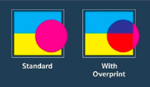
more information about overprints.
Overprinting is the process by which one color is printed on top of another color. When this happens, the bottom color can show through the top color and ruin the quality of your printed materials.